Bitter Truth
Distilling Dissatisfaction
Class
Typography 2
Instructor
Sean Bacon
Assignment
Menu
Service
Coffee Truck
Mood
Sour, Nihilistic
Appealing to the Apathetic
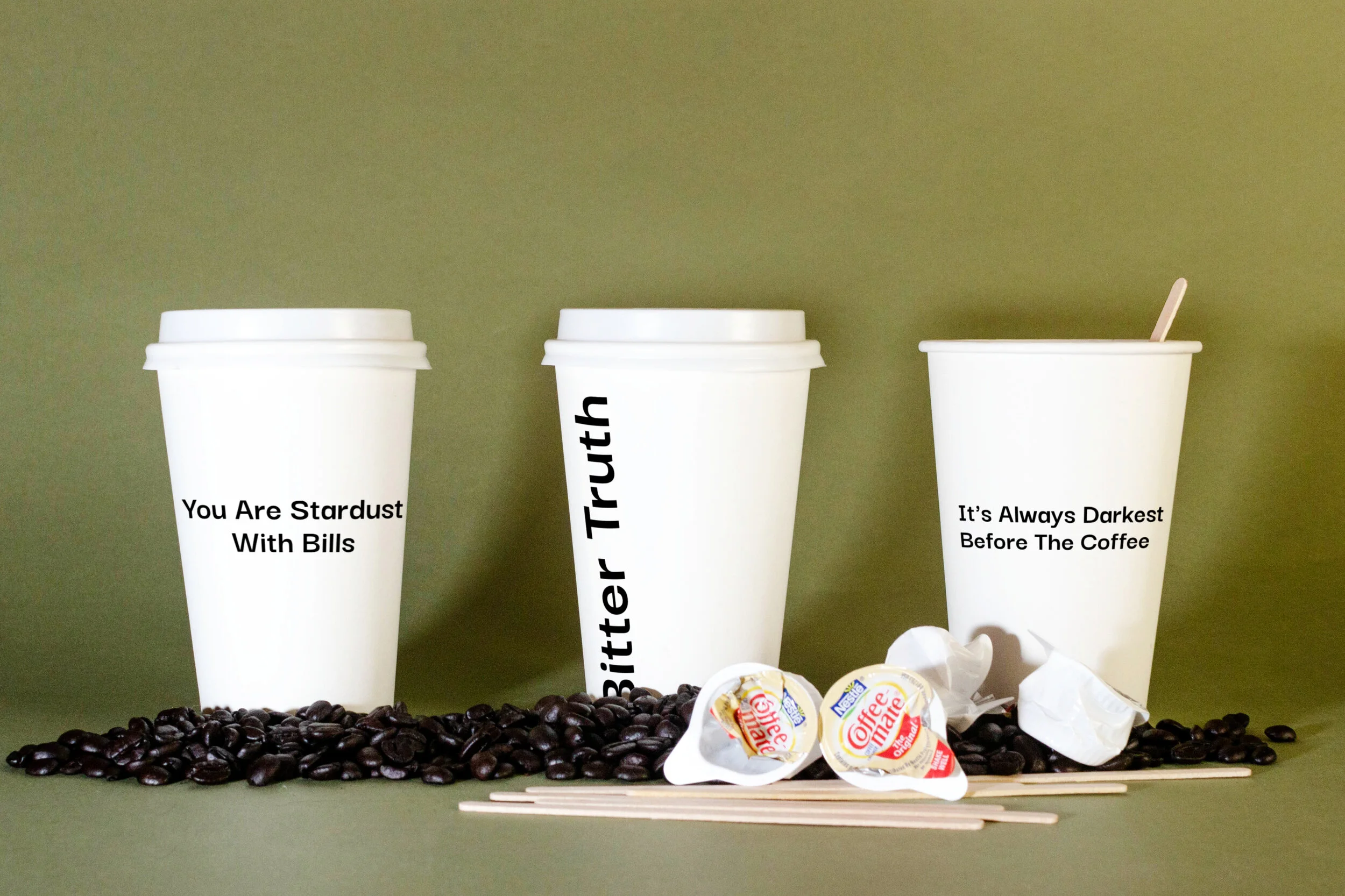
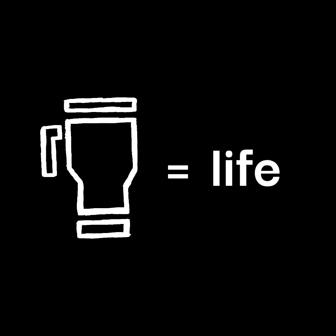
Bitter Truth is a coffee brand in touch with today’s modern woes. Aimed at the disenchanted twenty-somethings of the world, its simple greyscale palette and dark humor contrast the cafe aesthetics of other roasters.
The design choices in Bitter Truths branding all lend to readability. With clean fonts and high contrast color scheme, the bleary-eyed will order their cup of consciousness that much more easily.
Process
The language of the languishing
While the drinks don’t have fancy names, much of Bitter Truth’s color comes from the copy printed on the cups and packaging. The language used doesn’t pretetnd life is all roses. A tag team of nihilism and spiteful resolve make for a perfect pair. This and a cup of bean juice might help one survive the morning, noon, or night.


